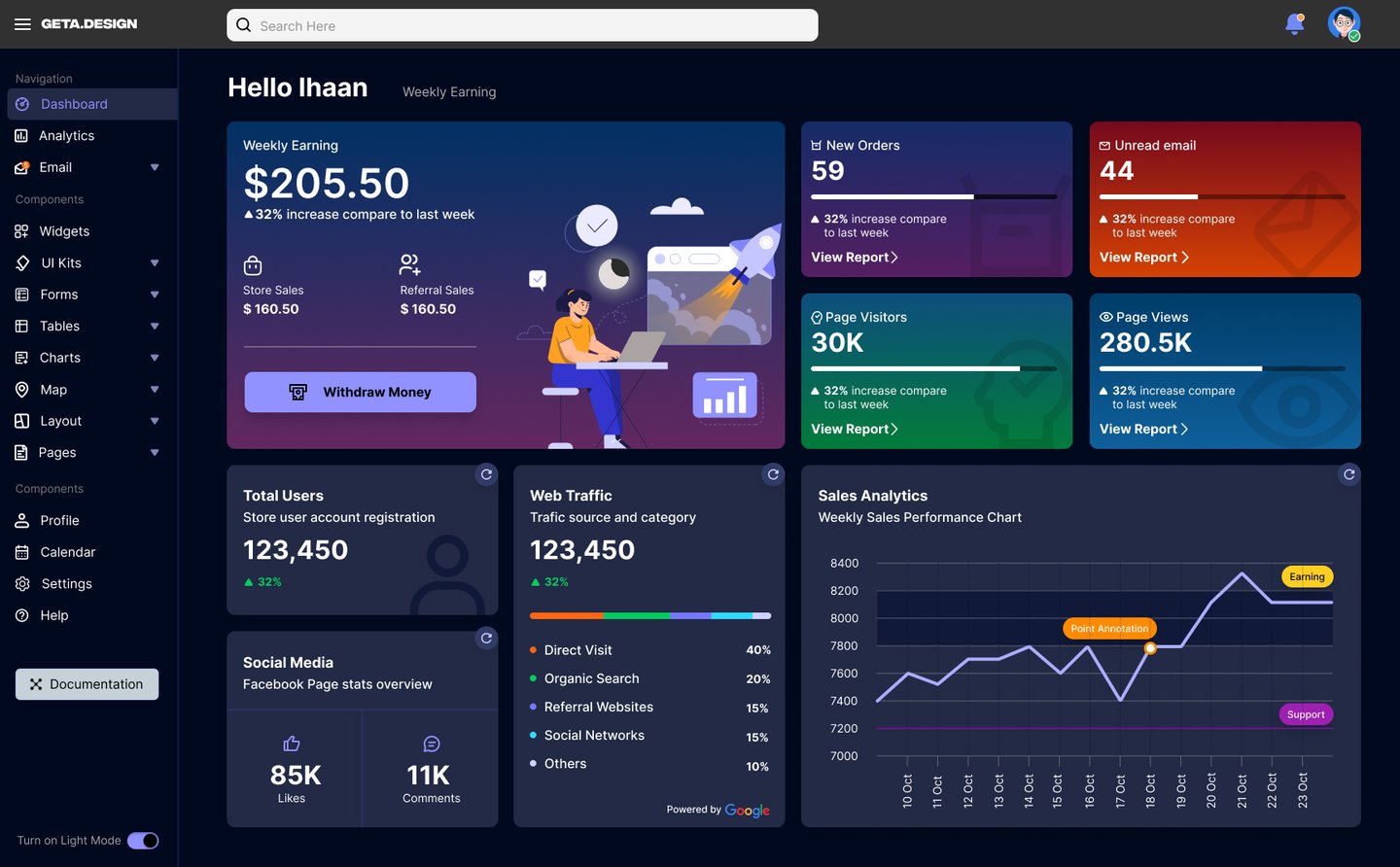
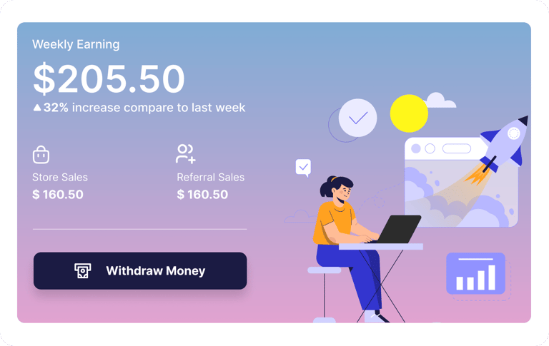
GETA Design – Dashboard UI
GETA Design is a modern SaaS admin dashboard concept designed to manage analytics, earnings, orders, and performance metrics in a visually engaging and structured interface. The project explores both Light and Dark UI systems while maintaining usability, clarity, and strong visual hierarc
Design Goals
Create strong visual hierarchy for data-heavy screens
Design reusable card components
Maintain consistency across light & dark themes
Use color strategically for analytics & alerts
Ensure modern SaaS visual language
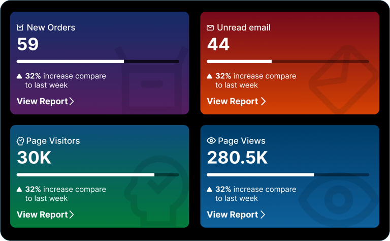
Light & dark mode
Instead of simply inverting colors, each theme was designed intentionally:
Dark Mode uses deep navy gradients for reduced eye strain
Light Mode focuses on soft neutral backgrounds for clarity
Cards maintain consistent spacing and structure across both modes
Accent colors remain consistent to preserve brand identity
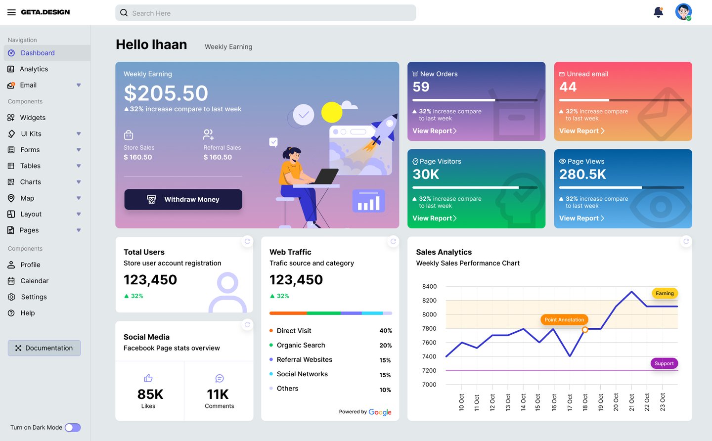


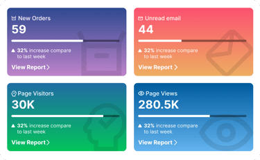
Light
Dark
Designing for both themes strengthened my understanding of contrast ratios, spacing systems, and color psychology in SaaS products. I refined my approach to component consistency and improved my dashboard layout strategy.