CaseDatabase - UI Redesign
A modernization of a legacy “CaseDatabase” interface into a cleaner, more structured, and faster workflow for intake and case tracking — while keeping the original data model intact.
Problem statement
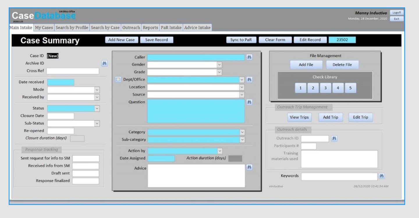
The original screen was functional but difficult to use at speed. Heavy forms + dense layout created:
Slow scanning (hard to find where to start)
High cognitive load (too many fields with equal visual weight)
Action ambiguity (important buttons blended into the UI)
Inconsistent spacing and alignment across sections
Redesign goals were to keep the workflow familiar while upgrading clarity.
Speed
Make data-entry faster with clearer structure.
Confidence
Prevent Design reusable patterns for future modules (File Mgmt, PaR Intake).
Process
Audit
Reviewed the legacy layout and identified high-friction areas (actions, grouping, scanning).
Before


Scalability
Design reusable patterns for future modules (File Mgmt, PaR Intake).
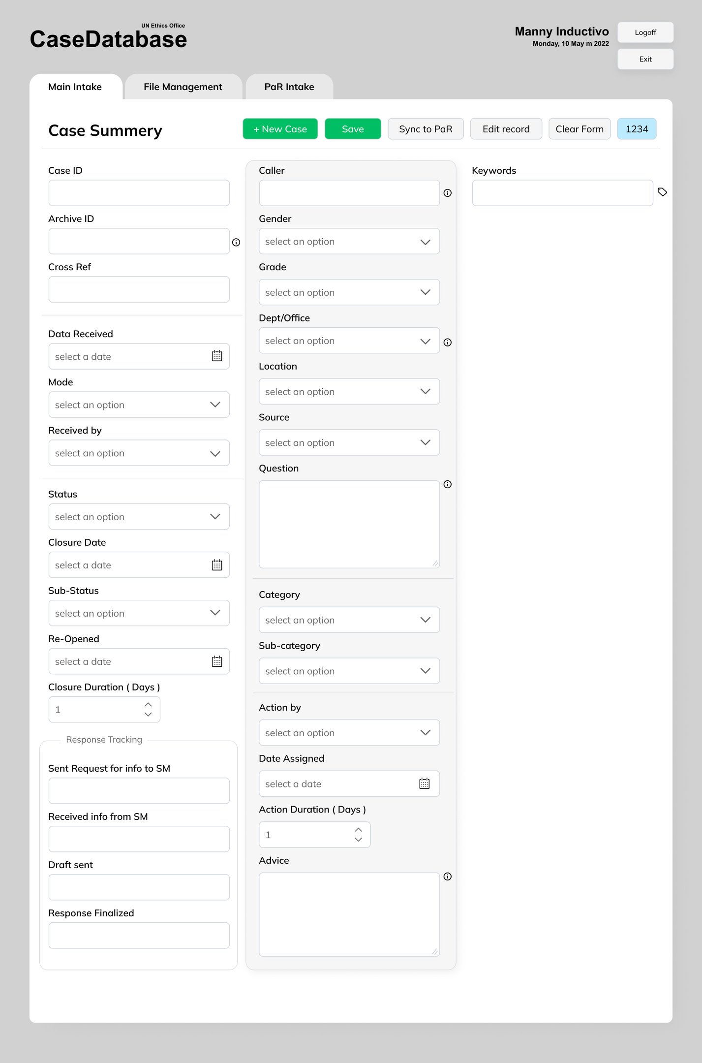
After
What changed
Reduced visual noise by grouping fields and improving alignment
More predictable actions (+New Case, Save, Sync to PaR, Edit record)
Cleaner navigation across Main Intake, File Management, PaR Intake
Improved form readability for heavy data-entry sessions
Faster visual scanning with clear section grouping
Reduced clutter and better alignment for heavy data entry
Clearer call-to-actions (Save / Sync to PaR / New Case)
More consistent UI patterns across modules
What Improved
Re-structure
Grouped fields by purpose and created a clearer visual hierarchy.
Modern UI
Applied consistent spacing, typography, and button hierarchy with safer primary actions.